TIP: Relative Strength Index (RSI Indicator)

3 EASY, Predictable, and Reliable Forex Candlestick Patterns
April 8, 2020
Your #1 Enemy If You’re a Forex Trader
April 9, 2020How To Use One of the Most Popular and Common Forex Indicators To Win More of Trades and Make More Money
What is the RSI Indicator?
The RSI indicator is an “Oscillator” or a numerical value given between 0 – 100 that indicates “Strength” or “Weakness” in a market.
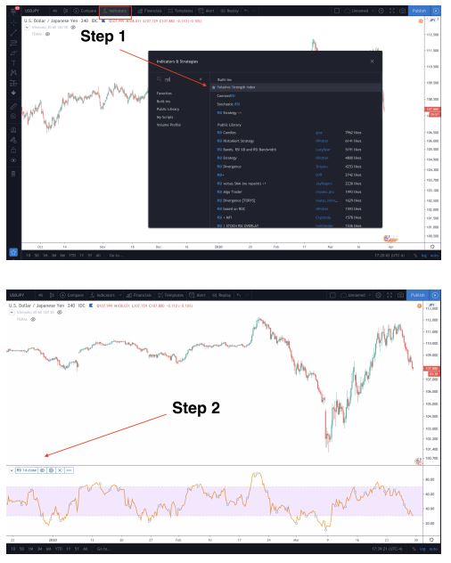
If you were to pull it up on any charting software (mine happens to be Tradingview) it looks like this
Understanding the RSI indicator Like a Rubber Band:
Now before I begin sharing through example, it’s important to have a fundamental understanding of how this indicator works and why it works.
So Imagine you have a brand new rubber band right in front of you. You pick it and hold it with your two hands, index fingers and thumbs. You don’t pull it or stretch it, you just hold it evenly. That would be considered a healthy rubber band. Now, let’s say you start to pull that rubber band on both sides. Just a little bit, then a little bit more, then a little bit more and then finally as far as you can pull it until one of two things happens…

What needs to happen? Well, that rubber band is either under so much pressure that it snaps OR it simply needs to move back to where it started to be healthy again.
That’s kind of similar to the RSI indicator. When you hold the rubber band loosely in your hand, the band is healthy. On the RSI indicator, this would mean any price equal to 50. If you pull the rubber band apart until it feels pretty tense, this would look like a value of 70 or 30 in the indicator. 70 on the upside and 30 on the downside. Now if you pulled the rubber band extremely hard on both ends, this would look like a value of 90+ on the upside and 10- on the downside.
The harder you pull the rubber band on either side, the more “unhealthy” it becomes, signaling it needs to “relieve some tension” by moving back to the “midline” of 50.
Examples:
In the images above, you’ll notice that the RSI indicator that comes “stock” in most Technical Analysis Platforms looks something like the one I have pictured above. It will be denoted “RSI 14 Close.” The number 14 denotes the last 14 candlesticks and where they closed (no wicks) in the formula to come up with the value. Next, you’ll notice that it has multiple lines. 2 of those lines will be horizontal at the “30 mark” and then another at the “70 mark.” The third line will be the one that goes zig-zag all over the indicator and that’s the “Oscillating” line.
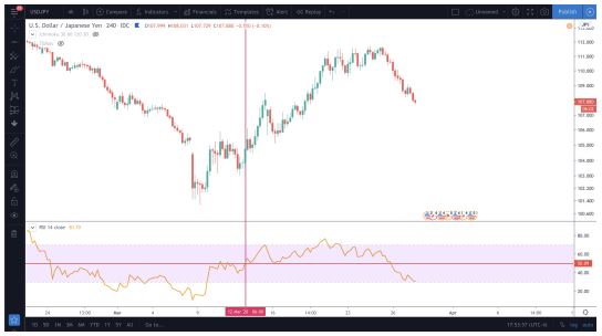
Each point in the oscillating line is an indicator of “strength” or “weakness” in the current price or value of the Forex pair at any given time frame. Below we have denoted that on March 12th at 6:00 am on the 4-hour candlestick chart, the price 104.717 on the USD/JPY pair, the price was fairly valued based on the RSI indicator.
Why was it fairly valued? because during that exact time, the RSI Oscillating line was at 50. Then at 2:00 pm the very next day, the price of the pair had gone up to 107.980 within 36 hours. The RSI climbed to 70 on the chart denoted by the red line on the image below.
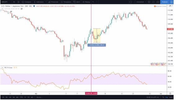
What happened directly afterward? A sell-off. Why? When the RSI reached 70 on the indicator, that signaled that the market was overbought.
In other words:
1. The higher the Oscillating line climbs, the more overbought the pair is. This signals it would be a good time to SELL.
2. The lower the Oscillating line drops, the more oversold that pair is. This signals it may be a good time to BUY.
Now, the next image shows that on March 19th at 2:00 pm, the price had climbed steadily to 110.845 and the RSI was at 77. This would mean that on the 4-hour chart, the price was close to being “Severely overbought” so any sell orders at this point would be more likely to succeed and make you money
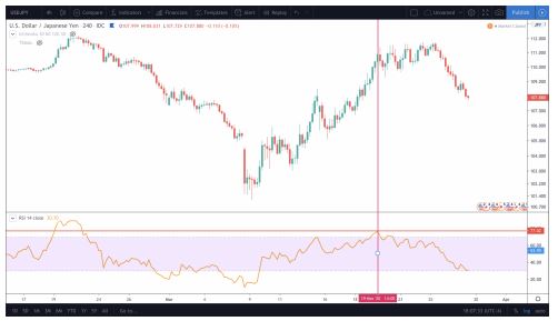
BUT that’s not what happened, is it? The price kept climbing, didn’t it? The price moved up almost another 1000 pips to 111.656 over the next week.
So what happened? If testing the rubber-band theory alone isn’t enough and looking for “overbought” and “oversold” prices won’t prove to be a good enough indicator, what do you do?
Identifying Bearish Divergence and Bullish Convergence
One of the best-known uses of the RSI Indicator is to use it to identify Divergences (where the price action and RSI move away from each other) or to find a Convergence (where the price action and RSI move toward each other). The other two are givens. Bearish meaning downward movement and Bullish meaning upward movement.
First, let’s use the example above on the USD/JPY chart. If you were to take your “line tool” on your charting software and draw one line from the time where RSI reached its high of 77 on March 19th to it’s the highest price on the chart on March 25th, you’ll see the line climbs up.
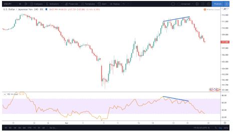
Yet on the RSI Indicator, if you were to draw an equivalent line from March 19th to March 25th you can see the line drops down. Both lines are moving away from each other signaling a divergence. As Price moves up, the RSI Indicator signals that the pair is “weakening.” That should have been your signal to sell. Finding a Divergence in the chart is a stronger signal than
just looking for overbought or oversold prices. Directly afterward, the price declines 3.36%, look at all of those red candles on the far right.
Why does this work well? Because The price of the pair and the RSI ARE NOT congruent. Although the price seems to be going higher, the RSI paints a very different picture and shows that the pair is weakening, hence the drop of 3%+.
NOTE: When looking for a Bearish Divergence, draw your lines on the TOP of the RSI Oscillator AND the Candlesticks.
Next, let’s look for an example of a Bullish Convergence. In the example below, you can see that we have drawn again, two-line on the chart. Both lines start and end at the same time-frames as each other and both paint a different picture. On January 26th at 5:00 pm the RSI was at 22 (indicating that the market was oversold) and the price was at 108.693. Then 5 days later, the RSI
had climbed to 30 (an 8 point difference) and the price had declined even further to 108.296.
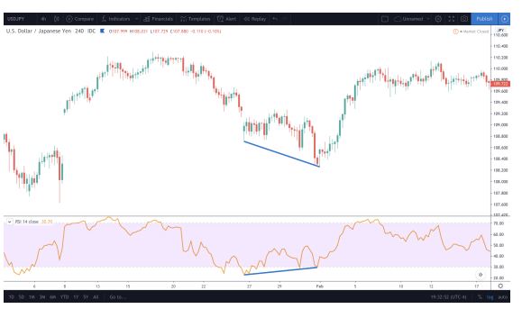
From the way the lines are drawn as price move lower, RSI is strengthening, you can see that they are converging or moving closer to each other. This would indicate that we are near the bottom of this move and its a good time to BUY or long the pair.
NOTE: When looking for a Bullish Convergence, draw your line on the BOTTOM of the RSI Oscillator AND the Candlesticks.
Now, go ahead and see if you can spot more convergences or divergences in the market to see if that proved to be a good indicator of where price action moved and then how far it moved in that direction.
Other Important Things to Remember When Using the RSI Indicators.
1. Although Bullish Convergence and Bearish Divergence set-ups are great indicators, they shouldn’t be used as your ONLY indicator for a trade set-up. You should look for “Confluences” or multiple reasons or indicators that point to the trade and WHY you think the price will move up or down. Then you use the RSI indicator to either Confirm
or Deny that trade. If they all point to the same conclusion, then it’s likely you have a good trade set-up.
2. Bullish Convergence and Bearish Divergence set-ups are more likely to play out on Higher Timeframes. Although they can work on shorter time frames like the 30 min chart or the 1-hour chart, they are also less reliable. If you use this indicator on the 4-hour+ charts or even the daily and weekly timeframes, they are far more likely to play out.


