Exponential Moving Averages (EMA’s): How to Use one of the Most Simple and Accurate Indicators in Forex

3 Legendary Traders
May 1, 2020
Killing the Sacred Cows of Forex Trading
June 3, 2020+ Two EMA Patterns that you can trade to Consistently Profit in the Forex Markets
No matter what kind of a trader you are, what time-frames you enjoy trading most, whether you’re brand spanking new to the Forex Markets or a seasoned trader, It’s likely that you’ve heard or consistently use Exponential Moving Averages or “EMA’s” for short.
Ps. If you’re already really familiar with EMA’s then skip over this section to Part 2.
For the rest of you “New to Forex Trading folk” here’s a little explanation on EMA’s.
An EMA or Moving Average is an indicator that is applied to your charts which helps smooth out price action by removing the fluctuations surrounding the market pair. It looks like one solid line on your chart.
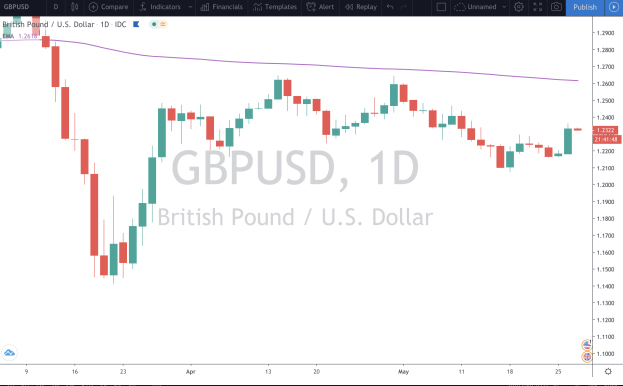
In the example below, the purple line denotes the 20-period Moving Average on the GBP/USD Daily Chart.

The line is there to indicate where the total sum average of the price would be based on the last 20 candles. In other words, you would take the price of each candle close over the last 20 days, add all 20 up, and then divide that number by 20 to come to the “average price.” Hence the name, “moving average.”
NOTE: When the EMA is above price, this confirms a Bearish trend, when the EMA is below the price, this confirms a bullish trend. The higher the timeframe, the more likely the EMA will confirm the true trend.
Now, if I changed the “period” or “length of that EMA to a lower value, the Moving average would ride closer to price. The opposite is usually true as well, the bigger the Period of the EMA, the more price action usually fluctuates, and the less the Average moves.
Here’s an example of an “8 period EMA”

Here’s an example of a “50 period EMA”

The 8-period “hugs” the candlesticks far more closely than the 50-period. However, this does not exclude the possibility that the candlesticks can “touch” or “bounce” off the bigger period EMAs. It simply means that the total of the last 50 periods usually provides a “wider gap” between candles and the total average.
Here’s one more example on that same pair and time frame of the “200 Period EMA”
Are you beginning to notice the differences?
Now, how do these different periods represent any viable data that helps you make a better trading decision?
Well, for starters, the larger the “Period,” the more likely it becomes a stronger indicator of the future price action (or where the price will go). Also, a bigger “period” acts as stronger support or resistance. Let’s zoom out a bit on that very same pair, move back to the 50 period EMA and remove the candlesticks to see if the 50-day moving average would give you a “good read” on where price might move
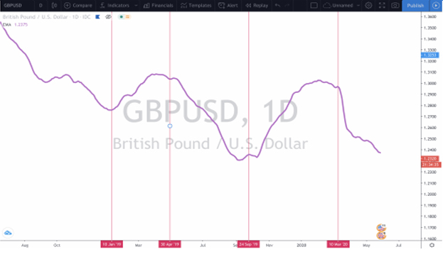
As you can see in the example above, the purple line looks like it’s in a LARGE downward trend where now and then it will try to climb up but only set a new “Lower high” or a point where the current “highest price” failed to climb above the previous highest price.” The pink vertical lines signal good areas where you could have entered a trade either long or short because the EMA started to turn.
Now, let’s see if that 50 period EMA was a good indicator of candlestick movement.
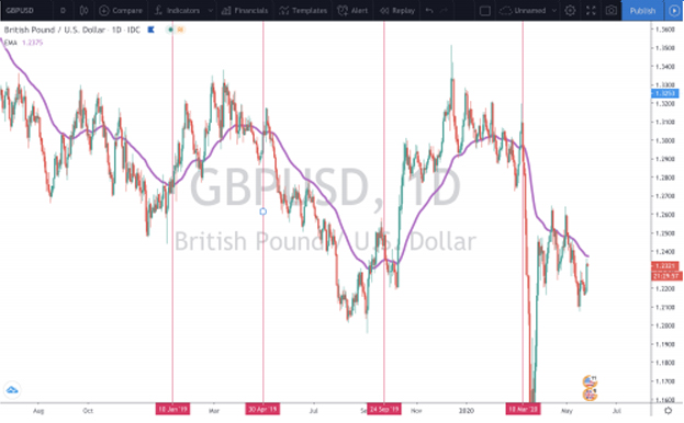
Do you notice what happened? In a way, it removed all of the “Noise” of the candlesticks and their erratic movements both up and down. The trend of the 50 Period EMA remained intact until it began to turn at either of the pink vertical lines.
Go ahead and mess around with EMA’s a bit on your charts to get familiar with them before we move onto the next part of this lesson and the problems that arise for most traders using EMA’s
Let’s move onto the mistakes that most traders make when using EMAs that get them into many losing trades, and then I’ll share 2 strategies that work pretty well which you can apply in your trading easily and effectively.
Everyone makes mistakes and as a trader, mistakes are how you learn. But if you want to make money you need to minimize the number of mistakes you make and maximize your disciplines.
The first mistake that most traders make is that they rely too much on EMA’s in their trader. If you want to be a consistently winning trader it’s important to remember that more than anything you need a set of rules and strategy that you STICK TO, no matter what you “feel” or “think” because your own emotions are your worst enemies and will lead you to financial ruin.
The second thing you need to remember is that a trading strategy usually consists of Multiple Indicators that ALL need to agree for you to enter a trade to maximize your likelihood of being on the winning side of that trade
PART 2
Mistake 1: Relying SOLEY on a single EMA to enter and exit a trade
In this example, we are going to look at the 50 period EMA on the USD/CAD Daily chart and use that line to enter and exit trades.
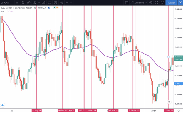
As you can see above, each pink line denotes a situation where a candlestick broke above or below the 50-period EMA. And if you were to do the math, whether you were long or short on any of these trades, you would have either made little to no money or even lost money.
In other words, this indicator on its own provides poor signals because although the price may move in the direction of your trade for a little while, by the time the price crosses on the other side, you’re late on your exit and will likely lose money in both price and fees.
Solution: Combine ONE Baseline EMA with another indictor for a confirmation.
Using one EMA such as the 50-period, the 20-period, or even the 8-period can be effective at times but will give you poor “signals” if used alone. So to increase the likelihood of being not the winning side of a trade, you can combine the EMA with another indicator like the Aroon.
In the example below, we will use the same pair we just used and see if we can combine the two signals to get a better signal.
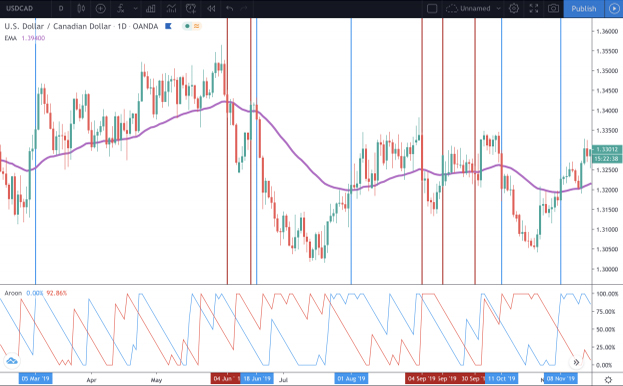
The first thing you will notice is that it’s a busy chart. At first, it may look confusing because It has this weird indicator at the bottom of the photo, the 50 period EMA and a lot of Lines. The Aroon is really simple and you will see in the points below.
So let’s break it down quickly.
1. The Blue lines on the Aroon indicator are the upward trend and the red lines are the downward trend. If the red line on the Aroon crosses above the blue line, then you have a Confirmed Down Trend. And the vice versa is true if the blue line crosses above the red line, then an UP Trend is confirmed.
2. To enter a Long Trade the Candlestick needs to Break Above AND CLOSE ABOVE the 50-period EMA. The blue line on the Aroon Indicator needs to be above the red line. Only when BOTH are congruent, do you enter the long position.
3. To enter a Short Trade, the candlestick needs to Break Down AND CLOSE BELOW the 50 period EMA. The Aroon indicator needs to confirm that trade by being congruent. You can ONLY enter a short position if the red line on the Aroon crosses above the blue line,
So what’s with all of the red and blue vertical lines on the candlestick chart above? Those are my drawings to show you trades that were confirmed on both sides and trades that you wouldn’t have entered because price closed above or below the 50-period EMA but was not confirmed by the Aroon.
As you can see, the Blue Lines were trades that you would have entered and the red lines denote trades you would have avoided
Go ahead and practice this strategy on your own. See if you can confirm longs or shorts and how much more accurate it would be than just trading solely off the EMA.
The other important thing to note is that you can toss this strategy on different timeframes and even different EMA’s like the 20-period or lower.
Mistake 2: Relying on Common “Crossover Patterns”
If you move with the heard, you will likely get slaughtered with the herd, especially when it comes to Forex Trading. Like I explained in THIS Blog Post, your enemies aren’t the other Forex Spot traders like yourself, your real enemies are the big banks who own the Foreign Exchanges, can see everyone’s order books, and trade against you with almost unlimited capital.
In other words, if 70%+ of the traders think the price is going to go one way, it’s highly likely the price will go in the opposite.
That’s why it’s also important not to trade like the majority of other traders do or even to “see” the same patterns on your charts that the majority of traders do because you will likely lose that trade.
One of the most common EMA patterns that traders like to reference is the “Golden Cross” (when the 50 period EMA crosses ABOVE the 200-period EMA) or the “Death Cross” when the 50 period EMA crosses BELOW the 200 period EMA). These are both very popular “crossover patterns” and usually signify a false breakout which is either unreliable or too late to the party
Below I’m going to share the EUR/USD Chart on the 4-hour time frame. The purple line denotes the 50 EMA and the Orange line denotes the 200 EMA. The first vertical pink line would signify a “Golden Cross” because the 50 crossed above the 200. The second pink vertical line would signify a “Death Cross” because the 50 EMA crossed down below the 200 EMA.
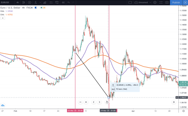
What do you notice here? If you were to enter the trade at a golden cross things would go well for a little while, but then if you were to wait for a death cross as your exit indicator, you would lose money. This would end up being a 454 pip loss. Huge by any standards. This happens quite often actually.
Here’s another example of an entry that’s good for a little while but then goes sour.
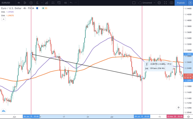
First, you miss out on the majority of the first impulse move up and get in a bit late toward the top Then if you had balls of steel, you would have held a losing position back down and in some steep drawdown. Things get a bit better and then by the time that dreaded “death cross” comes rolling in, you’ve been in the trade for 33 days and are now 77 down. Lost time and lost money don’t feel too good.
In many and most situations, a Golden Cross or even a Death Cross aren’t good indicators to trade by so what is?
Solution: Fibonacci EMA’s on Smaller Time Frames
Remember, an EMA is considered a “lagging” indicator which is why on the higher time frames and higher periods, you’ll enter a trade a little later than you should and exit in a loss. Not always, but many times.
So to counteract that “lag” a quick and easy solution would be to hop onto a lower time frame like the 1 hour or even 30 min time frames.
Then what you can do is toss a low period EMA like the “8 Period” and then pair it with a higher one like the “55-period.” Both are Fibonacci numbers. Other periods you can mess around with are the 5, 13, 21, and 34.
Then you can trade those crossovers for less “laggy” results.
But for the sake of this example, we will use the 8 and 55 on the hourly time frame for the AUD/ USD pair.
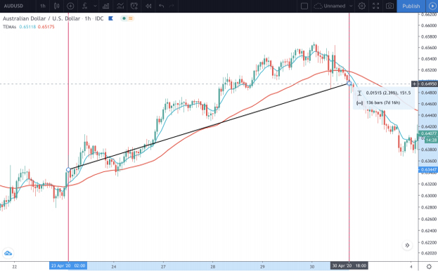
The photo above shows a Long Position you would have entered for a profit of 150+ pips. and the photo below is the same pair in the same time frame. It depicts a Short Position you would have entered for a whopping 600+ pip gain.
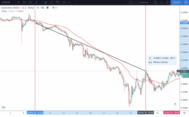
Now, this strategy can get a bit choppy at times and will have you entering and exiting positions when you move sideways, but if you stick to the system and create a formula for exiting trades for yourself that involve a 2nd indicator or “pip targets” this strategy can be highly profitable for you.
Once you’ve practiced this stuff enough, you’ll begin to see what works and what doesn’t. In this particular example, you’ll be using a pair of EMA’s that the majority of traders don’t use which will put you at an advantage in your trading. Happy Trading!


